Submitting a manuscript to SIGGRAPH is a really big achievement, so congratulations! This post is intended to provide some tips for handling the rebuttal period, an important (but often overlooked) milestone on the road to acceptance.
Processing review scores and comments
Reviews are released around ~1.5 months following the submission deadline. Each reviewer will independently read your manuscript and assign it one of the following scores:
Strong Accept
Accept
Borderline Accept
Borderline Reject
Reject
Strong Reject
You will generally receive a total of 5 scores, along with each reviewer’s more detailed comments.
It is common for reviewers to settle on borderline scores. You should keep in mind that what is written in the reviews is just as, if not more, important than the scores assigned. While the difference between Borderline Accept and Accept might appear subtle, the accompanying review comments offer a critical window into the mindset and leanings of reviewers. They can also help you identify whether any gaps in understanding or other sticking points might exist, so that you can be sure to address those in your rebuttal.
You should submit a rebuttal even if you received some extremely strong (or extremely weak) scores. Reviewers can (and often will!) change their minds after reading what other reviewers have to say. Carefully parsing through those comments can help you pinpoint the additional details or context needed to solidify the views of those reviewers leaning toward acceptance, and allay the concerns of those with less favorable views. Leaving questions unanswered by not submitting a rebuttal might risk making otherwise positive reviewers reconsider their support. You should therefore treat all questions and concerns raised as significant and worthy of being addressed.
As you process through the reviews, if you find yourself frustrated by the direction of a particular comment, try to give the reviewer the benefit of the doubt and assume that something in your manuscript was simply misunderstood. Although it is natural to want to spring to the defense when it feels like the work you invested so much into is under attack, you should take a step back and remember that reviewers are on the same side as you: we all share the common goal of wanting to see high-quality papers in our community get published.
Tackling the rebuttal writing
While no single approach fits all cases, the plan outlined below may help you focus your own rebuttal writing.
(1) Identifying action items
Start by carefully reading through each review, writing down each of the questions and comments that have been raised.
An approach that can be quite effective is to copy the entirety of each review into a single document, and try breaking down the text into action items. For example:
I thought that the method was interesting, but it lacked X and I am confused about Y.
In experiment Z, did the authors assume a and b?
- Action item – address lack of X (R2)
- Action item – address confusion resulting from Y (R2)
- Action item – explain assumptions in experiment Z (R3)
There is likely going to be overlap across reviews, so consider grouping similar points together as you compile your list. You should keep track of which reviewers raised each point as it helpful to directly address those reviewers in your responses.
(2) Drafting responses
After you’ve teased out the various action items implied by the review comments, you need to start drafting responses for each point. Some items might be easier to address than others. For example, a question about what you did in an experiment might be considered low-hanging fruit – a chance for you to clarify technical details and hopefully convey the robustness of your experiments. On the other hand, you may find yourself struggling to answer certain other questions. That is okay – the rebuttal is an opportunity for you to deeply reflect on the merits of your work, so a fair amount of time spent in contemplation should be considered natural.
Nevertheless, time is of the essence, so the most important thing to do is just start! Begin jotting down notes, even if incomplete, for each of the action items. A shared document where you can work simultaneously (e.g., Google Docs) is a great way to collaborate and iterate with your co-authors. Tagging each other within the document to escalate items, jumping on quick calls to brainstorm, etc. can all be effective tools for navigating this process.
By the time the reviewers read your rebuttal, they will have forgotten many of details of your paper as well as their own reviews. It is therefore important to ensure that your rebuttal responses are skimmable and self-contained. It should be clear what and who you are addressing, and relevant details should be summarized. For illustrative purposes, here is a response I wrote in my rebuttal for Point2Mesh [SIGGRAPH 2020]:
Preservation of Genus (R2 / R5)
R2 correctly pointed out that in the completion comparison we use the convex hull as an initial mesh which implicitly provides the correct genus to our approach. In this sense, the comparison is not entirely fair, since the other approaches do not use this information which gives an advantage for hole filling. Indeed, this can also be viewed as a benefit of our approach, since preserving the initial genus provides control, which is lacking in competing methods. Of course, in scenarios where the genus is unknown and ambiguous – the initial mesh estimation (e.g., alpha shape or poisson) can fail to estimate the correct genus. We will stress these points in the comparison and reiterate in the conclusions.
First, the title/section header summarizes the concern of the reviewers. Note also how the title emphasizes a positive aspect of our work (in that Point2Mesh preserves the genus, which is in fact an advantage). An alternative title, such as “Initial mesh gives unfair advantage in completion”, while acceptable might have unnecessarily injected a negative connotation.
The response that follows, in a short paragraph, allows the reader to tell what question is being answered without needing to refer to the original reviews. Additionally, the response acknowledges potential limitations or drawbacks; in this case, we noted that correctly estimating the initial genus is necessary.
(3) Preparing and organizing the rebuttal
Many rebuttals take on the following structure:
A. Formalities: You may begin by courteously thanking the reviewers for taking the time to review your submission. Keep this part short and sweet.
B. Opener: Depending on the specific circumstances of your paper, you might want to take the opportunity to address all reviewers in an opening paragraph or two. For example, if you received borderline or negative scores that you believe resulted from a misunderstanding, clearing that up upfront might be best. Similarly, if you think that a significant technical contribution was overlooked by the reviewers, reiterating the contribution (potentially with a different perspective) upfront could be a good idea. Confer with your co-authors and decide on what is most appropriate for your rebuttal.
C. Responses: By carefully reading and analyzing the reviewer comments, and thoughtfully preparing your responses, it is expected that you will have internalized the overarching themes and concerns of the reviewers. You likely will have noticed recurring patterns (e.g., did more than one reviewer misunderstand or miss completely an important point you assumed was clear in your text?) or other items highlighted by multiple reviewers. You should prioritize the ordering of your responses accordingly. Operating under the assumption that the attention span of reviewers will diminish over the course of reading your rebuttal, you should organize the rebuttal such that the most important points you want to make show up early on.
Additional points to keep in mind when preparing the rebuttal:
Be mindful of the tone of your responses. Consider your rebuttal similar to a Q&A or objective discussion of your work.
As mentioned, try not to let the emotions surrounding your investment in your paper prevent you from conducting your communications in a professional manner. Do not be rude, condescending, or confrontational! This will benefit nobody. Even if you are absolutely convinced that a reviewer is “wrong”, take the higher ground.
Be careful not to liberally paraphrase, recharacterize, or misrepresent the comments of the reviewers. Directly quoting a reviewer to argue your position should also be avoided, as this may be perceived as you pitting reviewers against each other.
It may be appropriate to offer to conduct additional experiments for the final version of the manuscript in response to points raised by the reviewers. However, if your paper is accepted, keep in mind that the acceptance may be conditioned on whatever you promise in the rebuttal, so make sure you are prepared to deliver!
Your SIGGRAPH project has resulted in something new and exciting, congratulations! Releasing great open-source software is a crucial last step of sharing it with the world.
This post is a tutorial on how to make your code release a success and amplify the impact of your work. It’s part of a series of blog posts on writing your first SIGGRAPH paper.
Why release code?
Releasing good code can dramatically increase the reach of your project, benefiting you–and many others–for years to come. More people will know about your project, use your method, and cite your paper—even distant users that you might never expect! In principle, a clearly-written technical paper provides all the details needed to implement a method, but in practice the burden of reimplementation is often an insurmountable hurdle. By providing ready-to-use code, you give an easy path for others to access your work.
Additionally, software is a form of communication. It precisely describes all of the little details of your research in unambiguous language, a valuable complement to the mathematical descriptions in a paper and the verbal descriptions in talk. In my experience, some readers will find it much easier to understand a new method by reading well-documented code than by reading a paper!
Lastly, code releases greatly improve reproducibility & replicability in computer graphics, that is, the ability to reproduce the published results of a method. When canonical code is released, it serves as a public reference point for a particular method, enabling the community to move forward and collectively do better research.
The basics
First and foremost, releasing code does not mean simply uploading the project code folder from your machine! The primary act of preparing a code release is converting your “experimental” code into software which is ready to be used by others. Other important aspects include documentation, hosting, and licensing. There’s a lot to think about, and it’s okay if you can’t do everything perfectly right, but every hour you invest will pay dividends in the long run.
Before going further, I should clarify that this tutorial will focus mainly on releasing “artifacts”, one-off codebases which are typically associated with a single paper. Developing large, general libraries or maintaining complex software systems projects is a very different challenge, which has more in common with mainstream software engineering practices.
Timeline
When working on a research project, you rarely write clean, well-documented code from the start, especially near a deadline. I generally recommend preparing a code release after your paper has been accepted, but before it is presented at the venue, around the same time you are preparing a talk.
In some cases, you might be able to prepare a basic version of your code earlier, for submission as supplemental material. If possible, this is great! Some reviewers are very appreciative when supplemental code is included with a submission. If your code is not ready for review, but is ready before the “camera ready” deadline for the paper, you can generally still include it with the final submission for the official archive (though policies may change; be sure to confirm these details).
As time goes on, think of your code release as a tapering process—you do a lot of work at the beginning, a little work after the initial release to add features and fix some bugs, and then later you just fix the occasional issue or update broken dependencies. Unlike managing a large living software project, paper artifacts rarely require significant time commitments over extended periods of time.
Hosting
Where should you actually put your open source code? These days, public version control websites like github and bitbucket are excellent options. They are reliable, searchable hosts, and seem likely to persist for many years to come (although they are not without some criticisms). Create a repository for your project, either under your personal account or some organizational account, and start committing/uploading code. For this purpose, it is even okay to do a single large “upload”, committing all of the files at once. If your repository is ever publicly visible in an unfinished state, add prominent text indicating as much.
Hosted version control like github can be used in addition to releasing a zip file archive of your code. Ideally, an initial version of your code can be submitted with your paper to the ACM Digital Library, while a github page offers a discoverable and updatable home for your code, incorporating new features and fixes. That being said, if short on time, releasing on github is probably the more impactful aspect.
Licenses and ownership
Software licenses dictate what others can do with your code, particularly in terms of (a) modifying & redistributing it, and (b) making money from it. This is a complicated subject—I am not a lawyer, and this is not legal advice!
In short, I strongly recommend an “MIT License” for research code. It is a very permissive license, which allows others to modify your code however they want, and even to use it in for-profit projects. At first, this sounds bad—what if someone steals your code? And don’t you deserve to earn some profit? But in reality, both of these outcomes are very rare, and on the positive side a permissive MIT License will further increase the impact of your code; any more restrictive license would create a significant barrier for those in the industry to use your software.
There are some exceptions. Your employer, your funding source, or those of your coauthors may place restrictions on how you can license the resulting code. Or perhaps you have an actionable plan to commercialize or otherwise profit from your research. If so, there are many other licenses available, and a code release is still very beneficial! Discuss these concerns early in your project to ensure there are no misunderstandings among the authors, and consider seeking real legal advice if you wish to retain exclusive commercial rights to your code.
7 tips for a great code release
The specific steps you follow to release code will vary greatly depending on the project and your own work habits. Rather than trying to list all possible steps, the rest of this tutorial will be a loose collection of concrete tips and best practices to help you be successful.
1: Make time to do it right
The single most important ingredient for a successful code release is you, the author, committing to invest time to make it happen. You might spend months preparing and fine-tuning the text of a SIGGRAPH paper to share your research; shouldn’t you at least spend a week releasing code, which is another important channel for sharing research? It may be difficult, because releasing code comes late in the process when a project is seemingly “done”, but investing that last week to release quality code will be worth it in the long run.
2: Libraries vs applications
For some projects, code releases are best structured as a library: a collection of functions or data structures that are integrated into other software. Other projects are better suited as an application: desktop/web/mobile programs which are driven by a human to create an experience or process some input. Think carefully about which approach makes more sense for work—how do you imagine others might want to use your code?
The best-of-both-worlds approach is to release code as a library and as an application. Implement your project as a library with general-purpose functions which can be called for key subroutines, and then build a separate standalone application on top of that library.
If you don’t have the time time to fully reorganize your codebase, focus on preparing the minimal necessary functionality that will allow a user to try out your method, or reproduce a key result from your paper. Once they have seen it work, they will be more willing to dig through your code and adapt it for their purpose.
3: Keep it small
It is not necessary to include every single thing which appears in your paper in your code release. This is especially true in SIGGRAPH papers, which might include a wide variety of demonstrations and comparisons. Identify the core functionality of your work, and condense it down to a simple command line tool, an easy to use GUI, or even a single function that can be called.
Various advanced features can be added to your code release as-needed, and it is okay if they are less well-documented or more difficult to use than the core functionality. Invest most of your energy preparing excellent code for the simplest, central idea of your project.
4: Code with users in mind
When we write code for a research project, we are motivated by “how can I perform this experiment?” When releasing code, instead ask “what will others want from this code?”
For instance, if someone else wants to pass their own data in to the code, what file formats might they want to use? How might they want the output? What pitfalls are they likely to encounter that can be anticipated and handled intelligently?
Let these kinds of questions guide you in preparing your code for release. If you find it even a little difficult to use your own code, then outsiders will find it extremely difficult to use!
5: Ready-to-run examples
Include at least one extremely easy-to-run sample in the repository. This provides a direct path for anyone to get started with the code!
If input data is needed, package at least one sample input in a subdirectory. For a command line application, provide copy/paste-able instructions to install and run the software. For a GUI application, include explicit step-by-step screenshot guides. The more direct, the better.
6: Documentation and images
Documentation is accompanying text which explains the usage and function of code. Documentation can take the form of inline comments in code, external documentation pages, or simply a text file—any of these is perfectly fine! What matters is that you include clear and precise text explaining what your code does. It is most important to document the public-facing portions of your code that a user actually interacts with, but documenting internals is also a valuable exercise in technical communication.
Readers are always drawn to appealing visuals. If possible, include exciting figures to show users what they will get from your code. These images will draw in casual passers-by, and advertise your work. Include at least one exciting image in your project’s top-level README or introduction, and use diagrams and figures within documentation wherever possible. Reuse your paper figures if you can!
7: Cross-platform code & bit rot
It’s very easy to write code that works great on your computer, but can’t be used on anyone else’s—and if you think it’s bad now, imagine trying to run your code in 20 years!
Most importantly, be sure to try compiling/running your software on machines other than your own before your release it. More generally, try hard to minimize the number of other software packages that your code depends on—simple dependency-free terminal applications are much more likely to survive the test of time than complicated applications built on frameworks which may be abandoned in 20 years.
Carefully document the versions of any dependencies which you do need, as well as steps used to compile or run your software. Include beginner-friendly instructions to help users unfamiliar with your toolchain run your code now and in the future.
Wrapping up
Hopefully this tutorial gives some guidance on releasing code for your first SIGGRAPH paper. Remember, all of this is a lot to get right, and you don’t have to do it all perfectly the first time! Your best-effort will still be greatly appreciated and valuable. Check out the other posts in this series for more tips on writing your first SIGGRAPH paper.
In this post we will go over why we make figures, different types of figures, what to put in different figures, how to make them, technically speaking, and finally we will discuss captioning. The number of figures you can afford and their size depends on the page budget of the specific conference/journal you are targeting, so keep it in mind. This document gathers some observations of what I enjoy in papers and have seen appreciated (or more often criticised) by reviewers.
What are figures good for?
Figures should help make a point. As with any communication, making sure the right point comes across is a challenge, so you want the figure to be clear and well presented. They are often the first thing people will look at when opening the paper, if you can convey the story of the paper through the figures and their captions alone (this is not always possible, but it’s a nice target), you make the paper much easier to read, and therefore the communication of your great research more effective. On the other hand, sloppy figures give off an “amateur"/ “rushed” vibe and does not inspire confidence to readers, so it’s doubly worth putting in the effort.
Illustration
Figures are a very good tool to support points you are making in your text and report results. When making a figure to illustrate a specific point, your goal is that any reader understands the example and agrees with your conclusion. Simplify the point as much as possible and use a toy example if needed. A figure should illustrate a single idea. Picking good examples is crucial, for example if you want to illustrate a precise limitation of previous work: pick an example on which this limitation is clear, and do your best to be convincing.
Illustrating a point is also a good way to give it importance. If it looks like something is a crucial detail in the text, adding a figure is a good way to “highlight” this detail and give it more attention, if you think it’s important.
Reporting
Figures can also be used to report more general information or results. Typical cases are results figures/tables. As before, results in these figures need to communicate information efficiently: pick typical examples which represent well what you want to report (e.g. the results of your method on expected inputs). Make sure the results which make it in the main paper are diverse and, ideally, illustrate different properties of your method (use the supplemental material for presenting a lot of results). Help the reader understand where to look, either via a careful layout (make important things bigger or isolated), or more explicit cues like arrows, bold text, inset zooms, or the caption. If you have a conclusion about the results, discuss it in the caption!
Figure 1: Example of a figure with both illustrative and reporting purpose. We illustrate the problem, and report the result of our contribution for this specific issue. Figure from “An Inverse Procedural Modeling Pipeline for SVBRDF Maps, Hu et al. 2022”
Figures can of course have both an illustrative and reporting function. For example with Fig. 1 we show that directly using previously existing method fails in some context that was important to us. We make sure the point is clear with a toy example, and report how our improvement solves this specific problem. At the scale of the entire method this point would have been very hard to make, but because we specifically illustrate it with a toy example, there is no question that the method behaves as claimed.
What to put in a figure
When making a figure, you need to think of what content you want there. In short: you want just enough to make your all your points as clearly as possible, nothing more. Each figure should illustrate a unique point, if possible.
A few questions can help you make this decision:
How important is the point you are making and how much space do you need to make the picture clear? Maybe it’s only worth a small half column figure, or maybe the point is complex and needs to be illustrated in a larger full page figure. But in any case, clarity is the most important point.
Does each component of the figure help make it clearer? If something sounds/looks cool but makes the point harder to get, maybe this example needs to go somewhere else.
If you just glance at the figure, do you get the point being made? What if you also read the caption? You want to answer yes to at least the second question, and ideally the first (it’s not always possible though).
Results and comparison figures
Results figure and comparison help readers understand what your method is good at and where it doesn’t necessarily improve on previous work. Ideally, you can show results illustrating different properties of the method: be fair and balanced in your choice of examples, by both insisting on the cases that work well to correctly promote your method, while fairly showing meaningful failure cases. For example your method works great for 5 out of 30 examples and terrible for the remaining 25. Picking only the top 5 is not representative of the method’s behaviour and presents an unfair bias towards cases with favorable results, while hiding those that fail. That’s generally called “Cherry-picking”, and this hurts the research community by claiming things that cannot be reproduced/generalized.
That is of course not to say that you should put only your bad results in these figure: you want to communicate how well the method works, while remaining honest about its performance. It is good practice to illustrate the quality of the method with a few diverse examples in the paper, showing the strength of the method, and have more in supplemental materials to help the reader get a good sense of the method’s behaviour. If you have a quantitative analysis, you can report the metric alongside the visual results, to let the reader know roughly how good a result is in comparison to the average behaviour.
Finally, pick visually pleasing/stunning examples if you can, this doesn’t necessarily help to make a specific point, but it has an impact on readers’ perception of the paper.
Teaser figure
Different people have different strategies when it comes to making teaser figures, but here is mine. The teaser is the first figure people will see. The teaser should:
Help understand what the paper is about. You can have a beautiful explanatory figure (make sure it’s abundantly clear, see this tutorial for example: https://research.siggraph.org/blog/guides/explanatory-paper-figures-with-illustrator-and-blender/), or results of the method in context, or an example of one of the major application of the method.
Make the reader curious. The goal is not to give an overview of the entire method, but rather to “tease” the reader, encouraging them to read the paper to see how you achieved this.
Manage expectation. Be careful of cherry picking your absolute best result for the teaser, it may set expectations the paper will not live up to. Make the teaser impressive, but make sure it doesn’t lead to disappointment when reading the paper.
Limitations figure
As you put your best foot forward with the teaser, results and comparisons figure to provide good examples of why your method is great, the limitations figure helps you set proper expectation and delimit the scope of your contribution. As it’s easy to cherry pick results, it’s easy to hide behind limitations which do not inform about the failures of the method.
Limitations can be hard to write because they highlight what doesn’t work so well, and you may want to hide a bit so that reviewers don’t reject the paper. This is a difficult balance and the responsibility is shared but don’t hide stuff, be honest and discuss the limitations of the work.
Don’t limit yourself to obvious limitations (“the model we use doesn’t support X, so neither do we”), limitations which are not really your fault (“previous work had this limitations, we don’t improve on that aspect”) or are obviously out of the scope of the paper (straw man limitations “our mesh based geometry editing method doesn’t handle raw pointclouds reconstruction”).
While it is fine to mention any limitation you believe is relevant, not all are worth the space required to illustrate them in a limitation figure. Discussing and illustrating the limitations of your contributions is, in my opinion, by far the most useful information after the method: it gives a clear picture of what is solved, and what is not. This can inspire people to build on your work, increasing its impact.
Keep this in mind when you reach the stage of reviewing! Consider twice before rejecting papers because of an honest limitation section. This is -in my opinion- a strength in a scientific paper rather than something to discourage, hiding limitations is a terrible incentive.
How to make figures
There are as many ways of making figures as there are ways of creating images and tables, but I describe here two that I found to work very well. See the great posts (here and here) on how to create great visualization and explain parts of your method.
Adobe Illustrator – Manually
Illustrator -disclaimer: the author currently works for Adobe- is of course a proprietary software, you can often get a license through your university or lab. Otherwise, Powerpoint or Inkscape also allows you to create nice looking figures. I personally use Illustrator, so I will illustrate my process.
When creating a new figure, I first evaluate if it should be full text width or column width. I then check the dimension of these for the current template I am using. You can often find this information in the default pdf generated by the template, but recent Siggraph information don’t seem to specify this, so you can measure it yourself. Just open your PDF with illustrator and use the measure tool to check the size of a column/ text width:
Figure 2: Choose what page to open in your PDF. All following figures use the paper “An Inverse Procedural Modeling Pipeline for SVBRDF Maps, Hu et al. 2022” as example.Figure 3: Make sure the Rulers are showingFigure 4: Right click on the Rulers to change the units to whichever you preferFigure 5: Select the “Measure Tool”Figure 6: Finally, measure the size of an existing figure or of the column. The measure here is the black line below the figure, and the values are displayed in the popup. Here the width of the column is ~8.73 cm
Given this width, I create a new illustrator document with the right width and an approximate height I want to spend in the paper to make this point (this also help create placeholder figures early on) –you can adjust the height later–, see Fig.7. From now on, don’t touch the width of your artboard: this is the amount of space you have available in width in your figure as defined by the template formatting instruction. Doing this avoid surprises of things getting stretched/compressed when adding it to the paper: it will look exactly the same at the same zoom level.
Figure 7: Illustrator interface when creating a new document. Circled in red are the dimensions to modify to match the width of your column in your desired latex template.
I then add the images I need, draw arrows or any other required content (the goal of this document is not to propose a tutorial on Illustrator, don’t hesitate to google what you want to do, there is a huge community. Again, check out the great posts (here and here) about how to visually communicate parts of your method).
One thing to be aware of is that Illustrator can either reference external images, or integrate them to the pdf itself. Pick what makes most sense for your need. I tend to like integrating them as it’s easier to share with co-authors if needed.
Other than images, almost everything in Illustrator is vectorial, meaning that it doesn’t have a fixed resolution, but rather will scale with the resolution at which it is viewed. This is useful in making sure your diagrams always look crisp –this is actually true for everything you include in a pdf. Next time you use MATLAB or matplotlib, generate a vector format rather than an image one. So if you can, don’t bake your whole illustrator figure into an image, rather export it as pdf, which preserves the vectorial aspect.
When adding labels I have a rough rule of thumb: size 8pt is a good default size, 7pt for sub-labels, nothing below 6pt (as your image will appear the same in your paper, you can easily check if this is comfortable to read at 100% zoom). A good habit is also to match the font in your figure to the font in your paper: you can install the default latex font (Computer Modern Roman or Latin Modern) or the one used in the Siggraph Template (Linux Libertine) in Illustrator.
Finally, once generated to pdf, figures with a lot of images risk being relatively large. With Acrobat Pro (sadly, requires a license), you can go to File/ Save As Other/ Optimized PDF and specify the maximum ppi (I like to use 600 to let people zoom in still) for different types of images, helping to get the size under control, without having to manually resize every image. Once exported, check that you can zoom enough to see what you need before seeing big pixels.
Latex – Automatic
An alternative is to create the figures directly in Latex. There are many different libraries to help you achieve different effects with subfigures or insets for example. But typically I create matrices of images with Latex (like for a results or comparisons figure). Doing this manually is exhausting and error prone. Instead it’s fairly easy to write a small python script that defines which images you want to display and how. This is much easier to maintain, and lets you change in a couple of seconds the images in the paper as you make that careful decision (or when your advisor can’t make up their mind). I recently discovered PyLaTeX which seems like a good tool to programmatically generate consistent figures, without requiring you to directly write text with python in a .tex file.
Label your figure
Labelling your figure properly is as important as having the right images. A figure needs to be easy to understand, and labels are a great tool for that. For example if you have a matrix of results, you want to make sure that each row and column are clearly labeled for quick parsing. See section above for the choice of font if you are doing the figure manually.
Avoid as much as possible abbreviations and ambiguous labels, you do not want the reader to have to go back and forth between the figure and its caption to understand it. Similarly if you are showing results from a method, it’s nice to have a citation, but a small label with the author’s or method’s name can help tremendously depending on the citation style.
Figure captions
The last component of a figure is its caption. If possible captions should tell the entire story you are trying to convey: point where the reader should look and discuss the conclusions you have in the captions. You want to avoid requiring the reader to go back and forth between the main text and the figure to understand your point, so make the figure self contained, even it means having some of the same conclusions in both the main text and the caption.
Finally, in the main text or in the caption, be careful of the claim you make. Given the evidence provided in text and figures, the reader should agree with the claims of novelty/quality you are making. If you overclaim (for example say that the results are greatly improved, when seeing the difference is difficult) you risk having readers disagree with your conclusion, potentially discrediting part of the contribution. This is of course a fine balance as you also do not want to under-claim either as you want your contribution to be easily parsed.
Conclusion
In summary:
Figures should be easy to parse and make their point clear with just the figure or at least with figure + caption.
Illustrate one idea per figure as much as possible.
Carefully pick the examples in your figure to illustrate your point (no cherry-picking!).
Minimize iteration time on figures: automate what is possible and spend a couple hours outside of a deadline familiarizing yourself with tools you prefer.
Figures and captions should be self-contained, allowing the reader to understand the point and, ideally, the story of the paper.
We thank Otman Benchekroun, Yulia Gryaditskaya, Adrien Bousseau and George Drettakis for proofreading. We thank Yulia Gryaditskaya for original suggestions on use of Illustrator for figure making.
This guide will show you how you can create figures that are intended to explain and clarify ideas from your paper. High-quality figures can simplify complex explanations and improve the presentation of your paper. In this guide, we’ll cover the entire process from conceptualising figures to producing them with a combination of Illustrator and Blender. Be sure to check out part one on rendering paper figures with Blender by Silvia Sellán if you haven’t yet!
First of all, I’d like to credit the people who inspired my style and process: Keenan Crane and Nicholas Sharp. Keenan has shared a very nice presentation on his process for creating figures, which I strongly recommend if you’re interested in creating beautiful, informative figures.
The Process
In this post, I’ve structured the process according to three main steps:
Along the way, I’ll use some example figures I created for a recent SIGGRAPH paper: DeltaConv. It suffices for now to show you the introductory figure and say that the paper deals with an issue of using local coordinate systemson surfaces and how to solve that when you want to generalise CNNs from images to curved surfaces. In this post, I’ll show you how I got to this figure and try to draw some lessons that you could use in your own paper.
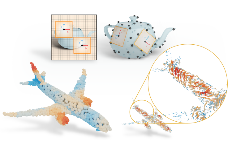
Figure 1: Images have a global coordinate system (left). Point clouds do not (right), complicating the design of convolutions on surfaces.
Guiding principles
To start, let’s establish a guiding principle: a paper figure should be judged by how well it serves its purpose: Does it communicateinsight? Many figures can be made better and prettier just by asking this question. Not with a special font, nor that fancy suite of software.
The next principle: good design is all about iterating until the figure is just right. Use tools that allow you to iterate quickly and progress to a more complicated tool in steps: iterate with a sketch on paper to figure out how you want to illustrate the concept and try out some compositions; then create a rough version in your preferred graphics software to figure out how you can translate the concept to clean lines and simple forms; finally create a polished version where you pay attention to alignment, tiny details and materials.
Planning figures
In an ideal situation, you think about where you would need figures as you are structuring and writing your paper. You can add placeholder figures (empty squares) to think out how your figures fit the flow of the story and give them captions that describe what each figure should show. Think of figures as backdrops for the main plot points in your paper and go along them from the perspective of a reader: add a figure wherever you think the reader might need some visual support.
Figure 1 was a solution to three ‘needs’ that arose when writing the paper:
we needed to show the problem, as the figure would act as a teaser for the paper,
we wanted people to think of coordinate systems on the surface, rather than in 3D (set the right mindset), and
we wanted our audience to know that the approach could work on point clouds.
Each of these requirements arose from feedback from collaborators as well as responses we got from external reviewers.
If you’re not sure how to identify this ‘need for a figure’, try to explain your core ideas to another person and take note of where your discussion partner gets stuck or when you try to visualise a concept with gestures. Maybe you refer to some ‘real-world’ concept, or you have the urge to draw the situation. That’s where a figure will likely help a reader as well.
Sketch and iterate
When you have identified the need for a figure and thought about what you want the figure to show, you can start creating it. A first step is to look at other examples that describe a concept close to what you’re trying to say, such as figures from text books.
For Figure 1, there were lots of figures in other texts that show the core idea: local coordinate systems on a curved surface. Here’s just one:
An illustration of moving frames on a curved surface. By Michael Spivak from “A Comprehensive Introduction to Differential Geometry”, vol. 2, p. 286.
Then, start creating in the medium that lets you explore and iterate ideas as quickly as possible. Good-ol’ pen-and-paper will do.
Here’s what that looked like for our intro figure.
Initial sketch for Figure 1.
It’s fine for a sketch: it tells us which components we want in it and gives some clue for the layout. It satisfies two of our goals (showing the problem, and setting the right mindset), but I’m not yet showing the audience anything of a point cloud. We’ll get to that in a later stage.
Iterate a couple of times on your sketch and try replacing your placeholder with the sketch. If you read through the text, does the figure show you what you were expecting to see?
Creating figures in Blender and Illustrator
I know that I said that better software alone wouldn’t give you a prettier figure, but let’s nuance that a bit: some tools are better suited than others. In general, I prefer using vector graphics, as they can be scaled to any size without sacrificing on quality. If you export a vector graphic as a PDF, you can directly import it in your LaTeX file as a figure. The paper PDF will be infinitely zoom-able with a minimal memory footprint.
I use Adobe Illustrator for vector graphics, but you’re free to use any tool you like. Sometimes you can get Illustrator through a license from your university or research group. If you don’t have that luxury, a free alternative is Inkscape. Every step I show can be recreated in any tool with support for vector graphics. If you are completely unsure how to pick one, try to find software that gives you direct control and the ability to align and distribute elements automatically.
In Figure 1, we have both a flat, 2D image and a curved surface in 3D. It’s best to use 3D modelling software to shape the 3D surface. I’ve tried to ‘fake’ it before in Illustrator, but it’s really tricky to get right. Our eyes can always spot a line that is just a bit too slanted or an oval that is thinner than it should be. We’ll use a combination of Blender and Adobe Illustrator to make figures of curved surfaces.
Why Blender? If you’re familiar with other kinds of 3D software (like 3DS Max, Maya, or Houdini) or have colleagues who can help you out with your figures, there’s no need to stick to Blender. The reason we suggest Blender in these posts, is that it is free and open source. In addition, Blender has grown a lot in recent years, both in quality of use and quantity of users, and has become a very usable and extendable piece of software with lots of community attention and support.
Getting started in Illustrator
Open up Illustrator and create a new file (File > New…). A window pops up where you can pick a document size. This can be somewhat confusing if you’re used to tools like Gimp, Adobe Photoshop or PowerPoint because
you probably don’t know how large you’d like your figure to be and
vector graphics don’t really have a ‘resolution’, since they’re defined as mathematical equations.
It doesn’t really matter which document size you pick. You can always resize the artboard (the name for the canvas in Illustrator) at a later moment. I typically choose ‘common’ in the ‘web’ tab, because it gives me enough room to work with.
The second choice we need to make is the color mode. RGB is used for screens, CMYK for print (Cyan, Magenta, Yellow, blacK). In most cases, I pick RGB, unless you know your figure will only be used in print. More often, people will view your paper on digital screens, so you can design your figure in the way it’ll be viewed most often. This can also be switched later on.
Click on ‘Create’ to open the new file.
Creating a new file in Adobe Illustrator.
Next, you’ll see the canvas and the main tools in Illustrator. In this tutorial, we’ll go briefly over some core tools. First, some basics: I’ll refer to the main blank area as the canvas (a.k.a. the artboard). This is where you can draw your vector graphics.
You can draw graphics with the tools in the toolbar(left).
Each of these tools has settings that you can control in the control bar (top).
The elements of your artwork are placed in layers (right).
The one tool that you can always return to if you’re stuck is the selection tool (press V on the keyboard). You can select and move objects with this tool and this usually gives you the behaviour you expect from a typical cursor.
Tip If you right click on the tool icons, you’ll see more options and the corresponding keyboard shortcuts. Try and learn those shortcuts, they’ll make your life much easier.
The main window in Illustrator.
We’ll start by importing the sketch and recreating it with some of the basic tools in illustrator.
The easiest way to do this, is to simply drag-and-drop the sketch onto the canvas.
Drag and drop images onto the canvas to include them in the file.
You can resize any object in Illustrator proportionally by holding shift while dragging the corners of the object. We’ll also set the opacity to 30%, so we can see through the reference.
Set opacity to 30% while selecting the object.
Next, lock the layer, so we don’t have to think about accidentally clicking the image all the time and add another layer below it to draw the figure.
Lock the reference layer and add another layer to start drawing.
Now we can start to roughly block out our figure in Illustrator using some of the basic tools (keyboard shortcuts in parentheses): the pen tool (P), the rectangle tool (M) and ellipse tool (L). You can always hold shift when using these tools to make sure that the elements are scaled proportionally (a square stays a square) or that the lines you draw are on a straight line.
Click the rectangle tool (M) and then click and drag on the canvas while holding shift to draw the main components.
Next, draw the circles on each of the coordinate systems with the ellipse tool (L). Holdshift and alt/option while dragging from the center of the squares to draw uniform circles (shift) that are centered around the cursor (alt). If you want to make sure that you place your cursor exactly at the center, check that smart guides are enabled (Menu > View > Smart guides).
Creating an ellipse.
Change the fill to black and stroke to empty.
Setting the fill and stroke for an object.
Finally, let’s use the pen tool (P) to add some curved lines and the surface. The pen tool lets you draw Bézier curves. You can add control points by clicking on the canvas. If you click and drag, you can also adjust the handles of the control points. The handles influence the shape of the curve. If you ever need to adjust a control point later on, you can use the direct selection tool (A), which allows you to adjust individual control points and handles.
Add the center arrow in the figure using the pentool. And click esc to finish the curve.
Adding a curve with the Pen Tool.
Adjust the stroke properties to add arrowheads. Click on Stroke in the control bar and select the arrowheads you want. Then scale them down to the size that fits.
Adding arrowheads to lines.
We’ve covered almost all of the tools you’ll need to get started:
the selection tool (V) to select and move objects,
the direct selection tool (A) to select and move control points,
the rectangle (M) and ellipse (L) tools to draw primitives,
the pen tool (P) to draw Bézier curves.
You’ll probably need one more thing: text. You can add text with the type tool (T). Click and drag on the canvas with the type tool to add a text box and type the text you want. If you want to adjust the character settings (sub/superscript, kerning, etc.), you can click on Character in the control bar. If you need to adjust things like alignment, click on Paragraph in the control bar.
Adding type and adjusting the settings.
It’s nice to have the fonts in your figures and the paper match. Either you can use the fonts used by the ACM template:
The result of this process is the following figure.
The first sketch in Illustrator.
Before we head over to Blender, some general remarks and tips:
Group objects by pressing ctrl/cmd + G to keep your file organised. Ungroup with ctrl/cmd + shift + G.
You can duplicate objects by using the selection tool (V) and holding alt/option while clicking and dragging the object along the canvas. You can also press ctrl/cmd + D to duplicate.
You can arrange objects from back to front with the shortcuts ctrl/cmd + } (bring forward) or ctrl/cmd + { (send back).
It’s important to evenly align and distribute objects. Your figure can look sloppy if things are off even slightly. You can use smart guides as shown before to snap objects along automatic guides as you move them. If you need more precise control, you always align and distribute objects by selecting multiple objects with the selection tool (V) and using the alignment and distribution buttons in the control bar. These are also available under Menu > Window > Align.
Alignment (first six icons) and distribution (last six icons) tools in Illustrator.
Illustrator to Blender
In Blender, we’ll create a simple surface, add images from Illustrator in 3D and render to an image that we’ll use in Illustrator again. We could, of course, build everything in Blender but that’s probably overkill.
Start by removing the basic cube (select the cube, press X, press enter) and add a grid (shift + A, Mesh > Grid).
Adding a new mesh.
We only need two subdivisions along each axis. Just having two subdivisions makes it easier to edit the mesh later on.
We create a grid with only 2 subdivisions.
Go into edit mode by pressing Tab and make sure can select vertices by pressing 1 on your keyboard. Then select some of the corner vertices and move them along the z-axis (G, followed by Z). In the sketch we made a saddle-like surface, so we’ll mimic that here.
Creating a saddle in Blender.
Go back into Object mode by pressing Tab and select the modifier tab (right, wrench icon). Add a subdivision surface modifier and increase the number of subdivisions to 3. Right click the object and select shade smooth to get a smooth surface.
Adding the subdivision surface modifier.
You can go back into edit mode to adjust the vertices to your liking. If you like, you can add some loop cuts toward the edges to sharpen the corners.
Adding loop cuts to sharpen corners.
Add a material to match your style. I like having a surface with muted pastel colours and high roughness, as it gives a nice matte look.
Adding a material to the surface.
Finally, I created a coordinate system image in Illustrator and exported it as a PNG.
Tangent plane coordinate system.
The quickest way to import this image into Blender is to enable the Import Images as Planes add-on.
Enabling the image as plane add-on.
Then add an image as plane (shift + A, Image > Images as Planes) and select the image you want to add.
Rotate the image plane to align with the x-y plane (press R, lock to y-axis by pressing Y, and type 90, followed by Enter to rotate 90 degrees).
Next, add an Ico Sphere at the center (shift + A, Mesh > Ico Sphere). Give the sphere a dark material, shade smooth, and add a subdivision surface modifier to smoothen it. This sphere will act as a point in the point cloud.
Finally, parent the image plane to the sphere: select the plane, then hold shift and select the sphere, then press ctrl/cmd + P.
Adding a point and parenting the image plane to the point.
Turn on Snap and snap to Faces. Now you can grab the point and move it along the surface to a place where you like.
We could even add a relationship between the normals of the surface and the image plane to make sure they align, but let’s keep it simple for now. Move the point to a nice location on the plane and rotate the plane to a good orientation that is roughly tangent to the surface.
I had to turn off Snap and offset the plane slightly from the surface to reduce intersections.
We’re almost there! Now we just need to add some points to the surface, to imply a point cloud.
Duplicate one of the ico spheres, select the surface and go to particle system tab (icon of graph). Add a particle system by clicking the plus sign.
Adding a particle system.
Set to a Hair. Under Render select Render as > Object. And pick the ico sphere under Instance Object. Adjust the scale to match the other points.
If you like, you can assign a vertex group to guide where the points should be spawned.
Finally, it’s time to render the image and bring it back to Illustrator.
Lights. Add an area light behind the camera, pointing to the surface and a smaller area light from the side to fill the shadows.
Camera. Place the camera in the position of your viewport by pressing ctrl + alt + numpad 0.
Action! In Render Poperties, select cycles as the render engine and under Film, check Transparent. Set the number of samples for the render to 32 or some other low number. Then render the image (Menu > Render > Render Image).
Render properties.
Once you’re done rendering, go to Image > Save Image in the render output to save the output.
From Blender to Illustrator
Now, we can bring the rendered image back into Illustrator by drag-and-dropping the file. I’ve changed some of the colours to harmonise better and added the coordinate systems I designed in Illustrator.
Bring back the image from Blender and harmonise color and design.
Finally, let’s crop the artboard and save the file as a PDF (File > Save as… > select PDF). Now you can use this file in your LaTeX document.
Cropping the artboard to the desired size.
Recap and next steps
We’ve gone through the following steps to create an explanatory figure:
Planning and sketching figures.
Using Illustrator’s tools to create vector graphics.
Making simple shapes in Blender and including images as planes to incorporate figures from Illustrator.
Bringing back images into illustrator and saving as a PDF.
We’ve only scratched the surface of what’s possible in Blender and Illustrator. I’m excited to see what you’ll design!
Some things you can try out for yourself:
Add outlines and tracings to your surface. You can either do this by hand in Illustrator or generate outlines automatically by enabling Freestyle in Blender’s Render Properties.
Outlines added with Freestyle.
Use Geometry Nodes in Blender to create figures procedurally. You can use this to import experimental data or create figures that are easily changed later on.
Points and tangent vectors were added in Geometry Nodes.
Animate your Blender illustration by using keyframes for presentations.
You can create animated gifs for your presentations, shown here: parallel transport.
This is a guide by Silvia Sellán originally posted on her own website, reproduced here with permission. Click here to see the original.This post is part of a series of guides on how to write your first ACM SIGGRAPH / TOG paper. You can find the other articles here.
There are a lot of great Blender tutorials online (e.g., the classic donut tutorial by Blender Guru), and they are usually aimed at artists or animators who want to generate full scenes from scratch for short films. Therefore they go into depth on how to model a shape, how to pick the best lighting, how to design a material, create textures, etc.
These are really interesting topics, but they can be overwhelming if you are an academic and all you want is to render your object beautifully for a SIGGRAPH paper figure. For this use case, there is way less documentation online (my labmate Hsueh-Ti Derek Liu’s Blender scripting toolbox is a great exception), and in my experience this can lead to a lot of frustration especially when nearing deadlines, when one does not have the time or energy to learn a whole new aspect of the software just for a minor change in a paper figure. Mitigating that frustration is the goal of this guide.
Also, one only needs to look through SIGGRAPH publications to see that all labs seem to have their own really polished “paper-quality rendering” pipeline, but unfortunately in my experience these mostly stay at the “tricks of the trade” level and aren’t shared very widely (not out of malice, there just aren’t many incentives for it). Another goal of this guide is to share my pipeline with people from other labs so that they (you) can hopefully learn something but also teach me something I am currently doing wrong or less efficiently (please email me!).
Anyway, here we go. Let’s pretend you wrote a fancy new method in C++ or Matlab or Python that outputs a mesh called output.obj, and you want to render it to put it in a paper figure (if you want to make an animation for your paper video, please see my other guide).
Open Blender (you can download it from here). You’ll see something like this
Before you do anything, go to Edit->Preferences, and on the Keymap section, pick Spacebar Action: Search. This will give you a very useful way of navigating the UI, instead of looking for each button you can just press spacebar and search for whatever is you’re looking for. This is something Oded Stein taught me when I started using Blender and it will completely change how you use the software for the better.
Click on the cube on the middle of scene and then on the letter X to delete it, we won’t be using it.
Go to File->Import->.obj and select your output.obj. It should appear in the screen:
Pan and move your view in the viewport until you have a good view of the object (the controls for this differ, but on my MacBook I use the trackpad with two fingers to pan, CMD + two fingers to zoom and SHIFT + two fingers to move the viewpoint).
Then, use the spacebar and type “Align Camera to view”. Press ENTER and you should see the frame of a camera appear.
At this point, we can still move our view around and all we need to do is click on the camera icon on the top right of our scene to go back to this camera view:
Let’s add a ground plane. To do this, we press Spacebar again and type “Plane”, choosing the mesh plane option.
Let’s scale the plane so that it covers all the ground seen in the image. To do this we go to the object properties (clicking on the orange/yellow square icon on the bottom-right toolbar), and input values for the X and Y scale; for example, 20 for each
A good practice to have after we’ve done a transformation like a translation, rotation and scaling and we are happy with it, is to “apply it”, i.e., lock it and make it permanent, turning a 1-by-1 scaled up plane into a 20-by-20 unscaled one. The difference is nuanced but it will be noticeable if you later use textures or physics. To do this we just use the spacebar and type “Apply all transformations”
A note: Blender loves crashing on you and deleting your progress. Save your .blend file and do it often.
Let’s see how our figure is looking. Right now we are looking at our shape in the default viewmode, in which we can see the geometries of the objects on the scene but not their materials or lights. To see what our figure would look like rendered, on the top right of our viewport we can choose the “Render preview”, the right-most of the sphere-looking icons.
By default, you’ll see something like this
This is using Blender’s internal non-raytracing engine Eeve, which is really fast but can fail unexpectedly. Since we won’t mind waiting a few minutes for our final render, we will switch to Blender’s raytracing engine Cycles. To do this we go to “Render properties” on the menu on the right and under “Render Engine”, we choose Cycles.
You’ll notice the render takes much longer to complete and you can see it progress from really noisy to less noisy since it is using a real raytracer. Soon you’ll get an image like this:
Don’t worry if it still looks quite a little grainy and noise, that’s because we’re looking at a preview. Blender will do many more samples when we ask it to render the image for real. But even from our preview, something is pretty obvious: both our shape and the ground have this chalk-like look, which is nothing but Blender’s default material. We need to give our objects a material before we render them.
To choose a material for your object, you have three options: One, you can watch and listen through the many tutorials there are on Blender material shaders (e.g., this); second, you can download the magnificent physically-realistic PBR Materials Add-on (follow its guide to learn how to use it, it’s actually very simple); third, you can use one of the geometry-paper-friendly non-physically realistic materials I have already designed for this purpose (using guidance and advice from Hsueh-Ti Derek Liu, Oded Stein and the colormaps from Cynthia Brewer). We will follow this last option, which begins by downloading my Blender template file. Once you’ve downloaded it, you don’t even need to open the file. Instead, from your own file, go to File->Append.
Then, navigate to template.blend. Click on it and then navigate to Material. Select all the materials and click on Append. Then, all the materials from the template will be loaded into your own .blend file.
Now, select your output object by clicking on it and go to Material Properties on the menu on the right of your viewport (the one with the red spherical symbol), where you’ll see something like this:
Click on the black-and-white spherical icon and select one of the new materials you’ve appended:
You’ll see the render update with the new material:
If you want, you can change the color by selecting “Shader Editor in the bottom left”
If you expand the bottom-most toolbar, you can see a node on the far left with a “Color” field from the color of the material. Just click on it to edit the base color used in the material (you don’t need to understand what any of the other nodes are doing at this stage).
Let’s minimize this node window again and go back to our render. The obvious thing that’s wrong still is the ground. It doesn’t have any material. In fact, most SIGGRAPH paper figures are transparent; they include shadows but the shadow is seen directly on the white paper background, instead of including a realistic ground texture or image. To obtain this effect we can click on the ground, go to Object Properties->Visibility and activate the “Shadowcatcher” option.
But that’s not all, we also need to go to “Render Properties” and under “Film”, activate the “Transparent” option. Only then will our render actually have no background.
We’ll see something like this, where the checkerboard pattern on the background is the clue meaning “this part will be transparent in the final rendered image”.
Okay, so now we have decided all the materials involved in our figure. The only step we need is to decide on the sources of light that will be interacting with those materials.
To pick the lighting setup in our scene, you once again have the option of learning from artists who have created amazing free tutorials on how to set up a scene in Blender (e.g., this). You could also append the lighting setup from my template file in the same way we just did for the materials, which I don’t claim is particularly good, just OK. The third option, which is the one I like the most, is to use one of Blender’s existing real-world environment lighting maps or HDRis. To do this, let’s go to the shader editor again:
and next to it, instead of “Object”, pick “World”.
If you expand this window you’ll see something like this
Now, we will add a node to this setup. But don’t be scared, we don’t actually need to understand much about nodes in Blender. Just use SHIFT-A (while your mouse hovers over the node window) click on “Search” and type “Environment texture”:
Then, click to set up an Environment texture node and connect its “Color” output to the Background node “Color” input by click-dragging your mouse, to get this:
(You may notice your render becomes pink-ish when you do this. This is fine)
Now, click on “Open” in the Environment Texture node and navigate to path/to/your/Blender.app/Contents/Resources/2.90/datafiles/studiolights/world/. You’ll find a bunch of .exr files there:
Pick any one of these (I like the “forest” one) and click on “Open Image”. You’ll see your render change, and include a more sophisticated lighting now. It is important at this point to remember to delete Blender’s default directional light. To do this we can click on “Light” on the top right of our viewport and press X to delete it
Finally, our object with a great realistic lighting setup will look like this:
Looks pretty good if you ask me!
You can now hyper-parameter-tune camera angles and positions as well as material parameters if you’re more on the perfectionist side 🙂 If we are happy with how it looks, we can render it by going to Render->Render Image on the top left. This step can take a while, depending on your computer’s performance power.
But good things come to those who wait. Once it’s done, you’ll see something like this:
You can save the image with Image->Save As, and feel free to paste it into your paper figure 🙂 Congrats!
Tips and Tricks
Rendering in a different computer
If you choose to send your .blend file to another computer (for example, a lab server) to render, then it is important you also follow two extra steps. First, make sure to select “File->External data->Automatically pack data into .blend” (otherwise your other computer won’t know where to look for the textures and objects in the scene). Also go to “Output Properties” and under “Output” make it a relative directory like // instead of the default /tmp/, or you risk losing your rendered images forever.
“There’s too much shadow”
Sometimes, your rendered image will have long shadows that don’t allow you to use them well as transparent images in papers; or they have ambient lighting which leads to an almost undetectable shadow everywhere in the image, that becomes apparent only when you put it on a white background. You can solve this (as Oded Stein showed me) by re-mapping the alpha values in the Blender Compositor (see the “Compositor” tab in the top of your blender UI). Here’s an example of the nodes in my template file’s compositor. The top part does the shadow removal (play with the thresholds to get more/less shadow), while the bottom does standard image editing to avoid having to do it in another software.
“The render preview takes so long!”
If, like me, you don’t own a supercomputer with powerful graphics cards, it may be that refreshing a render preview can take a long time, especially the more textures and files you have in your scene. It can ruin the feeling of interactivity in the software: what I like most about rendering paper figures using the Blender UI is that you can change something in your scene and see how that affects the image, and iterate like that. One way of getting this immediate feedback without spending thousands of dollars in graphics cards is to use a really nice feature called “Render Region”. Basically, this relies on the fact that when you’re iterating some aspect of your image, it is rare that you’re really looking everywhere in the figure to evaluate your changes. For example, if I am playing with the material of the main object, I could just look at one part of it to iterate instead of asking the render to simulate all the shadows and other objects in the scene. See what I mean by choosing the “Render Region” option, which I do by pressing Spacebar and searching for it:
Then, I drag my mouse to select a really tiny region of my render
I can them zoom in (CMD + Mouse Wheel in my Mac) and focus on the region I’m rendering:
Since now the preview is only rendering this tiny part of the figure, it will update much much faster when you change aspects in your scene; for example, the width of the wireframe:
Important: Make sure to remove your render region before you run the final render of your scene for your paper. I do this by Spacebar searching “Clear Render Region”. I have forgotten this step more times than I’d like to admit 🙂
Contribute!
This blog post is a work in progress which I hope can be useful, especially to new students starting out in our field and writing their first publication. Feel free to contribute to this post by emailing me suggestions and I’ll be glad to properly credit you for any addition/correction.
Some posts in this series cover a lot of technical detail. This one is less formal and more squishy, concentrating on stylistic issues for writing the introductory section of a technical paper.
In one sense the title, abstract, introduction, and entire paper, are increasingly longer versions of the same ideas. But they have different roles which should guide their construction. A good title is memorable and descriptive. The title and abstract are frequently read by someone who is deciding if they want to read your paper. If the answer will eventually turn out to be no, you will help them make better use of their time—allowing them to make an early exit—by being specific and concrete in your abstract and introduction.
An introduction is most useful when it helps align the reader’s expectation with your perspective of the paper’s content. Often a title will catch my attention, then I find the abstract a bit confusing, and I am well into the body of the paper before I realize that I misunderstood something about the paper’s scope. Perhaps unfamiliar terminology caused some ambiguity. Or the author’s assumptions and perspective were not made sufficiently clear. If a reader has not correctly understood the context, the body of the paper may feel confusing.
This is unfortunate when the reader is another scholar seeking to understand your work. It is even worse when the confused/frustrated reader is a reviewer deciding whether your draft paper will be accepted for publication. As an author you should work hard to ensure the typical reader can easily understand your exposition. This effort will be rewarded by helping a reviewer see the value of your contribution.
Some basics
At a minimum, an introduction should provide needed background. Initially assume your reader knows nothing about your specific topic. In a few sentences, explain the topic in simple concise language that could be easily understood by almost anyone. Then in a bit more detail, describe the specific topic of your paper. Explain what is unknown or unsolved, and how your research seeks to fill that gap. The introduction should function like a funnel, leading readers with various backgrounds and perspectives to become aligned with your view of the topic and your approach to solving an aspect of it. This helps them assimilate what follows.
Experts in your field probably know what you are talking about, the introduction is a chance to catch the attention of non-experts, or experts from other fields, who may be surprised to learn they are interested in your research. For those readers, your paper could be the first time they have even thought about this topic. Craft your introduction to lead these readers to a basic understanding.
If your topic has been well trod by other researchers, be sure to explain how your approach is unique, or perhaps how it works better than others. It might help to imagine a potential reader who has just read two other papers on this topic, and is trying to decide if yours is worthwhile. Can you convince them to read on?
Order of writing: some authors find it easiest to start in the middle of your paper, with the technical aspects on which you have been focused for so long. Once the middle has been drafted, the introduction can be written to provide a smooth “on ramp” into the gist of the paper. In this approach the abstract is written last, after the introduction.
Alignment
Bear in mind that you have been focused on your paper’s topic for months, if not years. You are not a good judge of what is obvious and what will be a confusing stumbling block to a reader coming in cold. It can be useful to have others read your introductory materials (title, abstract, introduction). Others in your research group may have useful feedback but in a sense they “know too much.” It is especially helpful to recruit people with significantly different backgrounds. People from other labs perhaps, or better, people from other departments. Can that friend of a friend over in biochemistry (or political science, or history) make any sense out of your introduction? Significant others or family members may help spot missing steps you forgot to mention because they are “obvious.”
If you can get someone with a differing background (perhaps wildly differing) to try to read your introduction, take careful note of questions they ask. (“What does this word/acronym even mean?” “You use this phrase in a way that seems different from everyday usage.”) These are ideas you must express more clearly. Add a sentence to explain a problematic word. Explicitly point out how a phrase is used differently in the context of your work. If your relationship (with this non-colleague, non-technical) reader permits, perhaps ask them some simple, gentle questions about what they read. Did they manage to follow most, or any, of the points you tried to make?
If your paper is published, most who read it will be in a field close to yours, and so understand your terminology and perspective. On the other hand if you are lucky, your paper might have broad appeal and may attract scholars from other fields. Someone in your field, say your boss, or a reviewer, will not be put off by an extra sentence of explanation or clarification at the beginning of your paper. And it can be especially helpful to a reader with a different background.
While the abstract needs to be concisely worded, there is room in the introduction to make clear what is not in your paper. If your technique could be applied in 2d and 3d settings, the introduction should make explicit how it is used in your paper. Resist the temptation to be vague to make your technique seem more widely applicable (2d and 3d) if you only discuss one case.
If you wonder why you should put effort into helping others decide more quickly not to read your paper, flip it around. Say you are on deadline, deciding which of several papers to spend time reading. You would certainly appreciate a paper that avoids wasting your time by being clear up front what it is not about.
Any sort of abstractions, or simplifying assumptions, that are key to an initial understanding of your technique, should be called out in the introduction. You might have decided early in your research to make a simplifying assumption to make this first step toward a larger research goal. Be sure to explain this in the introduction: why the simplifying assumption is reasonable, and how it can inform the more general case. A danger here is that you may think of your work a being on the larger topic X, but forget to clarify that this paper is actually about “topic X, for the case where β=0.”
Additional resources
Some other articles about how to write a paper’s introduction. These are general guides from universities intended for students. There are also lots of commercial services providing proof reading and copy editing services. We are assuming you and your coauthors will do all the writing and editing for your paper:
Ideas about how to introduce your topic to a reader who is unfamiliar with it and help them understand why it is interesting:
WIRED’s 5 LEVELS, videos where an expert “…Explains One Concept in 5 Levels of Difficulty.” These might help you think about how to demystify the topic—in which you are now an expert—so it can be more easily understood by others.
Two Minute Papers by Károly Zsolnai-Fehér. While the videos have gotten longer over the years, his energetic and upbeat delivery will convince you the topic and this paper are fascinating.
Kevin Kelly wrote a list of 103 Bits of Advice I Wish I Had Known including: “Spend as much time crafting the subject line of an email as the message itself because the subject line is often the only thing people read.” A journal paper is not an email, and the ratio of time spent might be different, but crafting an effective introduction can significantly increase the audience for your paper.
Annotated example
Introduction used with permission from: Nielsen, Bojsen-Hansen, Stamatelos, Bridson. 2022. Physics-Based Combustion Simulation. ACM TOG 41, 5 (2022) https://doi.org/10.1145/3526213
Text from the introduction of [Nielsen 2022]
Role for introduction
Fire, from small-scale candle flames to enormous explosions, remains an area of special interest for visual effects in movies, games, and commercials.
Start with a basic concept: fire. Place in context of effects production.
The complex interaction between fluid dynamics, heat transfer, chemical reactions, flame propagation, and resulting illumination makes for highly complex visual phenomena, difficult for an artist to model procedurally or by hand.
Problem to be solved: difficult to “direct” simulated fire..
While digital simulation of combustion phenomena has come a long way in terms of realism, it still in many cases does not match the quality seen in practical special effects. The movie Backdraft is an example of the beautiful practical effects that can be achieved using a combination of real fuels such as liquid and gaseous propane, pressurized alcohol, diesel, and MAPP gas to create a wide range of flame effects including texture, richness, and color [Shay 1991].
Basis of comparison: practical effects.
So: this paper is about realistically simulating fire while making it easy to control.
The ultimate goal of our approach is to provide combustion simulation workflows which reduce the time required by the artist to achieve physically plausible results. Ideally, simulation results should be physically plausible by default in the sense that they should come close to matching real-world footage of practical effects if real-world input characteristics such as fuel, oxidizer, wind, and geometric colliders are specified accurately in the simulation.
Goal: realism through simulation of the physics of fire.
User-intensive control and proceduralism should ideally only be required for final artistic tweaks, hero shots, or when the combustion phenomenon behaves in a supernatural manner. Using existing tools, commercial and proprietary, based on previous research on combustion simulation for computer graphics, talented artists can produce both realistic and beautiful results. However, it does in many cases require great skill and a significant amount of tweaking time. Our overall philosophy is to expand the scope of the underlying mathematical modeling of combustion, seeking out what is visually critical, and to make well-documented approximations where a compromise of numerical accuracy in favor of computation speed and visual fidelity makes sense for computer graphics.
Realism by default, while allowing production artists to control the result when needed.
With this in mind, we needed to expand the scope of prior work on fire and combustion simulation in graphics. We here propose additional mathematical models of the thermodynamic properties and stoichiometry of many of the real-world fuels used in practical special effects such as propane—enabling, for example, the prediction of adiabatic flame temperatures, which again facilitates less tweaking in the rendering stage. We couple this to a model of heat transfer that includes convection, conduction, and radiation; our main contribution in heat transfer is to solve for radiative heating more accurately than prior graphics work, for example facilitating ignition at a distance without heating up the intervening air. We model the combustion as infinitely fast chemistry and couple this with the thin flame model [Nguyen et al. 2002] as well as explicit species diffusion. Furthermore, the laminar burning velocities are spatially varied based on local species and empirical measurements. The jump in normal velocity at the thin flame front is captured using a novel expression for the associated divergence and allows for a standard fixed-stencil geometric multigrid solver to be applied. We also include physically validated soot formation and oxidation, as well as water vapor production and condensation.
Explain how this work differs from previous approaches, and how its approach provides additional benefits.
Interestingly, several heuristic techniques have emerged in visual effects production that at closer inspection to some degree address shortcomings in the current state-of-the-art mathematical models used in graphics. One example is the use of post-processing techniques such as blurring and masking to fake radiative heating and cooling [Cioroba et al. 2018].
Previous improvements have an ad hoc quality which could be replaced by a more principled approach.
The combustion approach proposed in this article allows us to simulate a wide range of deflagration phenomena that can coexist in the same simulation. This includes a combination of premixed and diffusion flames based on real-world fuels and oxidizers not demonstrated in graphics before (Figure 1(a)), diffusion flames (Figure 1(b) and (c)), spatially varying flame propagation (Figure 1(d)), fireballs (Figures 1(e) and 14), soot formation in smoky flames (Figure 10), soot oxidation in non-smoking flames (Figure 11), water vapor condensation (Figure 13) and ignition at a distance (Figure 8).
Outline some specific benefits of this approach. Here by making reference to figures later in the paper.
More specifically, our contributions to the computer graphics community include […detailed list of technical contributions removed from here].
Our solver has been implemented as a plugin for Autodesk’s Bifrost and is currently in production use. All results have been rendered with Arnold.
Concreteness: identify well known commercial software to identify context.
A physics-based approach to fire simulation for computer graphics has also been advocated by for example Stam and Fiume [1995], Melek and Keyser [2002], Nguyen et al. [2002], and Feldman et al. [2003]. In line with this research, the recent SCA 2020 keynote [Museth 2020] motivated a physics-based approach inspired by the problems faced in visual effects production when attempting to match real-world footage of an explosion using existing methods in computer graphics.
List previous physics-based fire simulation. Mention key criteria of matching live action scenes made with practical effects.
The work presented in this article includes material from and extends our SIGGRAPH 2019 talk on physics-based combustion simulation in Bifrost [Nielsen et al. 2019]. Our work is just one step on the way towards achieving the goal of physically plausible results by default. There are still many facets of turbulent combustion that computer graphics may benefit from and that could be explored. We also realize that the goal may be difficult to reach; in fact, turbulent combustion is not fully understood to this day [Peters 2000].
Connect with earlier versions of this work. Make clear this is not the last word in fire simulation.
How do I structure a paper? There is no right answer or silver bullet method when writing a paper, as with most other things about doing research. Some great papers are actually written by deviating from typical forms. But if you write your first paper, it would be good to see how the other people typically structure a paper. The typical structure would also make people also feel comfortable when reading or reviewing your paper. Here, I describe the typical way (that I think) to structure a SIGGRAPH/SIGGRAPH Asia (collectively “SIGGRAPH” below) paper. Basically, most SIGGRAPH papers organize sections in the order of introduction, related work, method, experimental results, and conclusion (the exact section names may not be the same, though). Let’s see them one by one.
Introduction
Craig Reynolds wrote a great article about how to write an impressive introduction, so I’ll not go into it. But in a nutshell, the rule of thumb is that the introduction is a summary of the whole paper, the abstract is also a shorter version of the summary, and the title is a one-phrase summary of the entire paper. Hence, it would be good to write the introduction after writing all the other sections, then the abstract, and then the title. While you would have an original goal of the project, you may find you adjust the narrative of the paper while you write the method and experimental results sections — it’s common that people realize what they wanted to say after writing the paper. Thus, you can better see how the introduction should be written after making at least a draft of all other sections.
Related Work
Related work is a relatively independent section from the others. While the related work section will also need to be tuned with the exact narrative of the paper, you can easily put a draft before working on the other sections. My typical strategy for writing the related work section is to
first list up all the related papers,
write a tl;dr-like a few sentences for each of them,
classify them into some categories, and
write a couple of paragraphs for each category based on the tl;drs.
(1) and (2) are the jobs you can do any time while you work on your project. 2-4 categories are generally ok. For the categorization, think about the literature on the problem you’re solving, and also the literature on the other techniques relevant to your algorithm. For instance, if you see CLIPasso [1], one of the Best papers at SIGGRAPH 2022, it’s about converting an image into a sketch using the CLIP model. Hence, the authors added paragraphs about “Photo-Sketch Synthesis” and “Sketches Abstraction”, “Vector Graphics” since the output is a vector presentation, and “CLIP-based Image Abstraction” since the method leverages CLIP. You’ll also be able to come up with more related papers after deciding on the categorization.
When you summarize the related work in each paragraph, do not just introduce each work but focus on delivering a summary of the whole literature and, more importantly, describe how your work is different from/related to the other work. Does yours solve a different problem? Does yours propose a different approach and achieve the SotA performance? Does yours leverage some ideas in the related work? Make a concise argument about the differences or relevances to the related work. Don’t forget that the goal of the related work section is not just to introduce the literature but to argue why your work is novel compared with previous work.
A couple of tips: If there is a series of work solving similar problems, and if there are some aspects you want to emphasize as advantages of your method, consider adding a comparison table with check marks. Table 1 in CLIPasso [1] shows a good example. Also, if there are a few previous works that are especially close to your work or the main competitors of your work, it’s worth making a separate paragraph for them and emphasizing the differences or advantages of your work.
Method
The method section does not need to be a single section; background, problem definition, overview, implementation details, etc can be separate sections, and even the method itself can be explained in multiple sections. Also, the title of the method section doesn’t need to be “Method”. Use the method name or the most effective keywords to describe the main ideas of the method.
Background. First of all, your paper should be self-contained, meaning that the readers should be able to understand the method without reading the other papers. Research papers target researchers as readers, and thus in a SIGGRAPH paper, you don’t need to describe any basic background of graphics. But if you think the readers need to know prior work to understand yours, it’s good to start the method section(s) with a background. You can also add the background in the related work section; see InstantNGP [2] and Spelunking the Deep [3], the other two Best papers at SIGGRAPH 2022, starting the related work section with background about positional encoding and neural fields.
Problem Definition or Overview. Before you get into the details of the method, first describe which exact problem you solve. What are the inputs and expected outputs? What are the assumptions? How exactly the inputs and outputs are represented? What is the given information? While defining the problem, you can also introduce some terms and math notations you’ll use over the rest of the paper. If your paper is also a system paper introducing a big framework with multiple components, start the method section with an overview depicting the big picture and a pipeline figure. Once you describe the whole framework, you can briefly mention how each specific component will be explained below.
Exposition. Do not write the method section like a cooking recipe or the readme file in your GitHub repository. Describe your algorithm, not the code. The readers want to see what are the key ideas of your algorithm. The implementation details can be added at the end of the method section, in the results section, or in the supplementary if you have a space limit. You don’t even need to explain your algorithm in the order of the pipeline. Explain the key components first. If you didn’t add an overview at the beginning, you can consider adding pseudocode at the end while describing how all the key components are integrated into the framework. Spelunking the Deep [3] shows a good example; see the pseudocode above Section 3.6 Implementation.
Figures and Equations. Utilize figures and equations as much as possible to explain your method more effectively and concisely. A figure can compress lots of words in the text, and an equation can also clearly state what you mean. Think about how you will place figures and equations while you write a draft. Note that equations need delicate design in math notations, like defining variables in coding. Before writing equations, draw the whole picture of your method in your mind, define all the math notations first, and think about how you’ll introduce the notation in the problem definition or the overview.
Experimental Results
Experiment Setup. First describe the dataset and the other experimental setups. There can be popular benchmarks for some well-known problems, and you’ll need not to miss them in your experiments.
Evaluations and Comparisons. Add figures and tables for qualitative and quantitative evaluation results. These are one of the most important parts in the paper review process, so take special care of them and make the best version through multiple iterations of polishing. Think about how you will order the results based on their importance and impressiveness; the most impressive results should go to the teaser by the way (the first figure right below the title and the author list). In comparisons, introduce proper baseline methods to be compared with your method and quantitative evaluation metrics. Analyze the qualitative and quantitative results in the text and highlight in which aspect your method is better than the baselines.
Ablation Study. Especially many neural-network-based approaches these days combine multiple novel components in the pipeline. Analyze the effect of each component while ablating one by one in the experiments.
User study. Using human perception is sometimes the only way to properly evaluate the performance of your method. Bylinskii et al. [4] provide an excellent guide about conducting user studies for computer graphic research in their article. mturk-2afc [5] repository from Brown University is also helpful for some basic user study tasks.
Applications. It would be a big plus if you can showcase downstream applications based on your method. For instance, in my paper, ComplementMe [6], I showed an interactive modeling tool based on an iterative part assembly method. You can put the applications at the beginning or at the end, depending on whether you want to emphasize the applications or the outperformance of your method compared with baselines.
Conclusion
The conclusion is not just another summary of the paper. Don’t forget to discuss the limitations of your method and future directions. The conclusion is typically written at the very end of the writing; it’ll be definitely easy to conclude your paper after writing all the other sections.
Page Limit for Conference Track
This year, SIGGRAPH introduced the conference track that has a 7-page limit except for the references. Even when you prepare a conference track submission, I recommend not to consider the page limit when you write a draft. Make a submittable paper while putting all the content, prioritize the content, and then cut out from the least important one (actually, don’t cut out but move things to the supplementary). Also note that small adjustments in the size and margin of figures, tables, and equations can make a big space. Your job right before the submission after all the polishing steps would be to play with the space and make an exact 7-page paper.
Final Remark
There is no rule in paper writing. See that the submission guidelines in SIGGRAPH homepages do not describe anything about the paper structure. The above is just an example, and also different venues have different typical forms. For instance, in machine learning conferences (e.g., ICML and NeurIPS), the related work section sometimes goes after the experimental results. I hope this blog helps you to prepare your first SIGGRAPH submission and eventually find your own way to write a paper.
This tutorial will help you to set up the LaTeX environment to write your first ACM SIGGRAPH / TOG paper.
What is LaTeX?
LaTeX is an old text editing software that works differently than Microsoft Word / Google Docs or other modern text editors you might be used to. LaTeX is closer to programming than it is to Microsoft Word. In LaTeX you write your text together with commands in a plain text file, and this plain text file is then compiled, like a program, to a PDF. There is no direct editing of the document. If you want to change someting in the PDF, you edit the source plain text file, and you recompile the document.
LaTeX has many advantages and it has many disadvantages. It is possible to create very professional-looking mathematical formulas, and most maths textbooks you are familiar with probably created their formulas with LaTeX. On the other hand it can be very difficult to control. Unlike in Word, you cannot really decide where in the document your figures end up, and where a pagebreak will be.
LaTeX is actually a collection of programs that have accumulated over time. As such, in order to install it, you usually install a LaTeX distribution that contains all programs needed. I recommend different distributions for different operating systems:
These distributions come with their own text editors to edit LaTeX source, but you can use your favorite editor that you already use for code. Most editors have syntax highlighting for LaTeX in one form or another.
You can skip all of this by using an online hosted LaTeX service like Overleaf. Overleaf will make sure that they have a correctly set up LaTeX environment with all needed packages.
This tutorial is not a LaTeX tutorial. Luckily, there are many good LaTeX tutorials online, here are a few:
In order to create a SIGGRAPH / TOG LaTeX submission, you must use the official ACM template, which is available here: https://www.acm.org/publications/proceedings-template. Scroll to the bottom of the page and download the template.
Screenshot of the ACM template download page with the link to the LaTeX template highlighted.
The folder contains a lot of files that you do not need for a SIGGRAPH / TOG paper. Feel free to delete all files except for
Depending on whether you submit to SIGGRAPH or TOG, you will need the sample-acmtog.tex or sample-sigconf.tex file. I usually remove that file from the samples directory, place it in the root directory, and rename the tex and bib files to the name of my paper:
Before you submit, you have to fill out CCSXML and keywords. Go to http://dl.acm.org/ccs.cfm to pick the correct categories for your paper.
\begin{CCSXML}
<ccs2012>
 <concept>
  <concept_id>10010520.10010553.10010562</concept_id>
  <concept_desc>Computer systems organization~Embedded systems</concept_desc>
  <concept_significance>500</concept_significance>
 </concept>
 <concept>
  <concept_id>10010520.10010575.10010755</concept_id>
  <concept_desc>Computer systems organization~Redundancy</concept_desc>
  <concept_significance>300</concept_significance>
 </concept>
 <concept>
  <concept_id>10010520.10010553.10010554</concept_id>
  <concept_desc>Computer systems organization~Robotics</concept_desc>
  <concept_significance>100</concept_significance>
 </concept>
 <concept>
  <concept_id>10003033.10003083.10003095</concept_id>
  <concept_desc>Networks~Network reliability</concept_desc>
  <concept_significance>100</concept_significance>
 </concept>
</ccs2012>
\end{CCSXML}

\ccsdesc[500]{Computer systems organization~Embedded systems}
\ccsdesc[300]{Computer systems organization~Redundancy}
\ccsdesc{Computer systems organization~Robotics}
\ccsdesc[100]{Networks~Network reliability}
In addition to CCS, make sure to also specify some user-defined keywords for your article. They can be arbitrarily chosen by you. Pick the ones you think describe your article best.
\keywords{relevant,key,words}
If you submit to SIGGRAPH, make sure to enter a submission ID!
\acmSubmissionID{123-A56-BU3}
You will have to fill out the copyright and journal commands after acceptance.
This author info should include your ORCID. If any of the authors do not have an ORCID yet, you can set up your ORCID here: https://orcid.org/register
Finally, after your paper has been accepted, you can turn off the review mode and deanonymize your article by changing the first command to:
\documentclass[sigconf]{acmart}
OR
\documentclass[acmtog]{acmart}
Generic LaTeX tips
While we will not go over how to use LaTeX here, there are a few generic hints that will help you be more productive when using LaTeX. I use these practices for every article I write.
Use macros extensively. In LaTeX you can you can define a macro using the syntax \newcommand{\commandname}[2]{first argument: #1, second argument: #2}. You will probably use a lot of mathematical language, which can be very wordy in LaTeX. Make your documents more readable by using macros for these. For example, I usually use the following macro for R2,\newcommand{\Rtwo}{\mathbb{R}^2}, and the following macro for the norm of a vector, \newcommand{\norm}[1]{\left\lVert #1 \right\rVert}.
Use different LaTeX files for different sections of your paper. So, for example, instead of having the main part of your article consist of a single file with all of the text included,
\section{Section}
Text
use different files and import them into your main file with \input{file}.
This helps organize your document. If you have collaborators, this also allows you and your collaborators to work on two different files at the same time without risking conflicting edits.
Use versioning to keep track of your changes, as well as making collaboration easier. There are two options I recommend for this:
Use git to keep track of your edits. Here is a basic guide on how to use git. This gives you full control over your article, works even without an internet connection, and does not make you dependent on any third party.
Use an online LaTeX editing and versioning system like Overleaf. Overleaf handles all the hosting and the versioning for you. The downside of this is that, in times of high demand, the quality of Overleaf service can be spotty.
Bibliography
In LaTeX you will use BibTeX to cite other articles and manage your bibliography. Like LaTeX itself, BibTeX is vast and complicated (here is a guide). We will here look at a few basic and simple tips on how to use BibTeX.
Your references are located in a seperate .bib file. You import it into the main LaTeX document with the following command, which you should put at the end of the document, where you want the bibliography to appear:
%% Bibliography.
%% Uncomment the bibliography line and link to an actual bib file
\bibliographystyle{ACM-Reference-Format}
\bibliography{bibliography.bib}
The .bib file contains the items you can cite in its own special format. Please refer to the BibTeX guide for a more complete explanation of the format. Many journal websites contain an easy way to export BibTeX information for an article. For the ACM digital library, you can find BibTeX citations for any article here:
An example of a paper on the ACM Digital Library with the cite button highlighted.A screenshot of the ‘export citations’ screen on the ACM Digital Library.
Beware: The citations that are available on journal formats often contain a lot of extraneous information that is not needed, and can make your bibliographies unnecessarily long. ACM’s citation for the article “Least squares conformal maps for automatic texture atlas generation” looks like this:
@article{10.1145/566654.566590,
author = {L\'{e}vy, Bruno and Petitjean, Sylvain and Ray, Nicolas and Maillot, J\'{e}rome},
title = {Least Squares Conformal Maps for Automatic Texture Atlas Generation},
year = {2002},
issue_date = {July 2002},
publisher = {Association for Computing Machinery},
address = {New York, NY, USA},
volume = {21},
number = {3},
issn = {0730-0301},
url = {https://doi.org/10.1145/566654.566590},
doi = {10.1145/566654.566590},
abstract = {A Texture Atlas is an efficient color representation for 3D Paint Systems. The model to be textured is decomposed into charts homeomorphic to discs, each chart is parameterized, and the unfolded charts are packed in texture space. Existing texture atlas methods for triangulated surfaces suffer from several limitations, requiring them to generate a large number of small charts with simple borders. The discontinuities between the charts cause artifacts, and make it difficult to paint large areas with regular patterns.In this paper, our main contribution is a new quasi-conformal parameterization method, based on a least-squares approximation of the Cauchy-Riemann equations. The so-defined objective function minimizes angle deformations, and we prove the following properties: the minimum is unique, independent of a similarity in texture space, independent of the resolution of the mesh and cannot generate triangle flips. The function is numerically well behaved and can therefore be very efficiently minimized. Our approach is robust, and can parameterize large charts with complex borders.We also introduce segmentation methods to decompose the model into charts with natural shapes, and a new packing algorithm to gather them in texture space. We demonstrate our approach applied to paint both scanned and modeled data sets.},
journal = {ACM Trans. Graph.},
month = {jul},
pages = {362–371},
numpages = {10},
keywords = {texture mapping, polygonal modeling, paint systems}
}
and renders, in the LaTeX bibliography, as
A wordy bibliography entry.
This is unnecessarily wordy. I usually trim down an entry to only what is needed, and give it a catchy name that will make it easier for me to cite later:
@article{Levy2002,
author = {L\'{e}vy, Bruno and Petitjean, Sylvain and Ray, Nicolas and Maillot, J\'{e}rome},
title = {Least Squares Conformal Maps for Automatic Texture Atlas Generation},
year = {2002},
volume = {21},
number = {3},
journal = {ACM Trans. Graph.},
pages = {362–371}
}
This now renders as follows, which is more compact but still contains all needed information:
A more concise bibliography entry.
The name Levy2002 instead of 10.1145/566654.566590 makes it easier to reference this article throughout the text.
Using the identifier Levy2002, the article can now be referenced throughout the main document. There are three different ways to do this, and they depend on how you are using your reference in the article.
If you want to reference an article such that the citation has no specific grammatical function where it occurs (i.e., the text would make just as much sense grammatically if you just removed the citation), you use the citecommand:
Least Squares Conformal Mapping (LSCM) can be used to compute UV maps \cite{Levy2002}.
An example of \cite as rendered by LaTeX.
If you want to use the name(s) of the author(s) in a sentence, you use the citet command instead:
The Least Squares Conformal Mapping (LSCM) method of \citet{Levy2002} can be used to compute UV maps.
\citet shows the author names in a sentence.
If you want to repeatedly use the name(s) of the author(s) in your text, you should not repeatedly use citet and render the publication year. Use citeauthor instead:
The Least Squares Conformal Mapping (LSCM) method of \citet{Levy2002} can be used to compute UV maps.
\citeauthor{Levy2002}'s approach is particularly suited for our application because of its efficiency.
\citeauthor only shows the author name.
Figures
Figures in LaTeX are included with the following command,
where filepath is the path to a PDF file that contains your figure.
Including figures in LaTeX is a bit of an art, and people have lots of different opinions on what the right and wrong ways are to do it. I will here show you how I do it.
I recommend you create your figures in a vector graphics app, such as Adobe Illustrator or Inkscape. Set your application to create PDF documents that can then be directly included in your LaTeX document. I personally use Adobe Illustrator.
There are two kinds of figures you will be creating for your paper: figures spanning one column and figures spanning two columns (these are created with \begin{figure*} and \end{figure*}, notice the *). Set up Illustrator to create an empty figure with exactly the right width for each figure type. You can find out the witdh for one column figures by printing the linewidth in your LaTeX document:
\the\linewidth
For me, this outputs 241.14749pt. The width of two column figures is determined by:
\the\textwidth
For me, this is 506.295pt.
The current ACM SIGGRAPH / TOG template uses the Linux Libertine font. I like to use the same font for any text that appears in my figures. I also like to match the font size to the caption font size. You can find out all kinds of information about your used font with the following command (source):
\expandafter\string\the\font
For me, this gives a font size of 9pt.
I also like to set the document color mode to RGB (instead of CMYK), since my papers will probably mostly be viewed on RGB computer screens. I have created, for myself, empty Adobe Illustrator PDF templates from which I can start my figures. For your convenience, here is my one column version, and here is my two column version.
It is very important to not only provide a caption for your figure (\caption), but also a description (\description). The description is presented to users of screen readers who are not able to view the image for some reason. Your article should make sense for readers who can not view images, but rely on descriptions alone. For example, Figure 5 of the least squares conformal maps paper is:
A figure and its caption, rendered by LaTeX.
A potential description for this figure would be: “A: a dragon mesh segmented into various parts; the algorithm favors cylindrical segments. B: a sock-shaped cylindrical protrusion has an additional cut inserted by the method to minimize distortion.”
There is one special kind of figure that functions differently from all other figures: the teaser figure. The teaser figure appears at the top of your article, and you do not control its positioning. It is specified with the following command at the beginning of your article, and otherwise behaves like a two column figure:
\begin{teaserfigure}
  \includegraphics[width=\textwidth]{filepath}
  \caption{Teaser figure}
  \Description{This is the teaser figure for the article.}
  \label{fig:teaser}
\end{teaserfigure}
I will end this section with a few best-practice rule of thumbs that I use when creating my figures. None of these are hard rules, but if you are not very sure about what you are doing it is probably best to follow these until you have a little more intuition.
Try to avoid whitespace in figures as much as possible. Page real estate is valuable in articles, so do not waste it. Make all parts of your figure fit together like a puzzle with as few blanks as possible in between.
Do not arrange the parts of your figure in exotic ways. In an English-language article, people read from left to right, and then from top to bottom. Somebody who looks at your figure should be able to understand the figure by reading it from left to right, and then from top to bottom. Do not require your readers to look at the parts of your figure in a different order. To make the order of reading absolutely clear, you can add arrows.
Ideally, your reader will understand the point of your figure by merely looking at the images, without having to read the captions. The captions can add additional detail or provide context, but the figure itself should not be unintelligible without reading the caption.
If you add text to your figures, make the font size large enough so that the text can be read without zooming in. Unless you have a good reason not to, use the exact same font size as the caption in your figures.
When arranging figures, put them either on the top of the page, or on the bottom of the page. Try to avoid having a picture at the top and one at the bottom of the same page, which sandwiches your text in between figures.
You do not want the text of your articles to be lost in figures. As a rule of thumb, your figures should not take up more than half of each page on which there is also normal article text. If you need more space, insert a page in your article that has only figures and no text.
Compression
When you create your PDF (especially if it contains lots of figures), its filesize will be very large. Very large filesizes are not good for many reasons, and you should compress your PDF to reduce its filesize as much as you can without sacrificing image quality before you upload it to the submission site or share it with other people.
There are many ways to compress a PDF. My preferred version uses Adobe Acrobat, and closely follows the settings of Alec Jacobson. Open your PDF in Adobe Acrobat, select the “compression” option, and then open the advanced compression options. In this options dialogue, use the following settings:
Color Images: Downsample to 600dpi if above 600dpi
Color Images: Compression JPEG
Color Images: Quality Maximum
Grayscale Images: Downsample to 600dpi if above 600dpi
Grayscale Images: Compression JPEG
Grayscale Images: Quality Maximum
Monochromatic Images: Downsample Off
Monochromatic Images: Compression JPEG
Monochromatic Images: Quality Maximum
Uncheck “fonts”
Check “discard objects”
Uncheck all except “discard all alternate images” and “discard embedded print settings”
Check “discard user data”
Uncheck all except “discard private data of other applications” and “discard hidden layer content” and “flatten visible layers”.
Check “clean up”
In “object compression options”, set “compress document structure”
Save this profile as your custom compression profile so that you can quickly use it in the future.
Since there is a limit for how much you can compress your PDF without sacrificing quality, but there are users who can only download very small files, I also recommend producing a highly compressed (<2MB) version of your article (with loss of quality) when you decide to share a preprint. Make both versions of your preprint available in one location.
Checksumming
If you plan to submit your article to ACM SIGGRAPH, and you are working up until the very deadline, it can happen that the PDF submission closes before the actual deadline. When this happens, do not despair: until the deadline is passed you can still submit a MD5 checksum of your article.
A MD5 checksum is a hash function that generates a 128-bit hash for any file. Instead of uploading a 30MB paper (and potentially overwhelming the SIGGRAPH server if everybody does this at once), you compute the MD5 checksum of your paper PDF, and upload that instead. It is reasonbly difficult to reverse, so you can not cheat by uploading a checksum, continuing to work on your paper, and then trying to fiddle with the PDF to find a hash collision.
There are different utilities for each operating system that will compute the MD5 checksum for you.
On Max OS X, the md5 command comes with the operating system and can be used in the command line via md5 filename.pdf.
On Linux you can use the md5sum command, which should be available in your distribution’s package manager. Make sure to download it ahead of time, and not at the last minute!
On Windows you can use the built-in certutil command to compute MD5 checksums, certutil -hashfile filename.pdf MD5.
So, on my Ubuntu Linux, I compute the checksum like this:
It is very important to not lose the PDF that you generated your checksum from. Make sure to immediately copy it to somewhere you will not accidentally overwrite or delete it. Upload it to your online storage. Share it with your collaborators. If you checksum multiple times, make sure to keep track of which PDF generates which checksum. At last, do not forget to upload the article that matches your checksum after the deadline is over!
Closing thoughts
This was a basic introduction on how to write ACM SIGGRAPH / TOG papers in LaTeX. I wish you good luck for your submission!
You are about to write your first ACM SIGGRAPH / TOG research paper. Congratulations on making it all the way here! We know that this is a daunting task. There are a lot of moving parts to a successful paper submission and the required steps can often seem complicated and opaque to a first-time submitter. The goal of this series of guides is to provide a gentle introduction to all the tasks you need to perform in order to submit your article and get it published.
Of course, these guides are no replacement to the official ACM author’s guide, ACM ToG author’s guide, and ACM SIGGRAPH author’s guide. Please refer to these documents for the actual binding submission guidelines.
We wish you success with your submission, and can’t wait to see your exciting research at SIGGRAPH / TOG!
If you have any questions, or want to contribute your own guide to this series, please contact us at ostein@usc.edu .
We thank all authors for their contribution: Rana Hanocka, Valentin Deschaintre, Nicholas Sharp, Oded Stein, Craig Reynolds, Ruben Wiersma, and Silvia Sellán.
For proofreading, we thank: Otman Benchekroun, Lingxiao Li, Mazdak Abulnaga, Yu Wang, and Ana Dodik